Repository (Code and Data-sets)
Covid – 19 Data-set
General Overview
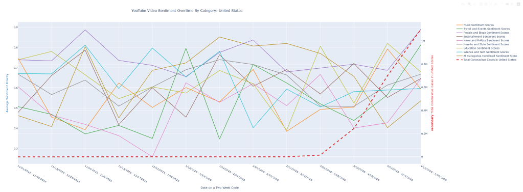
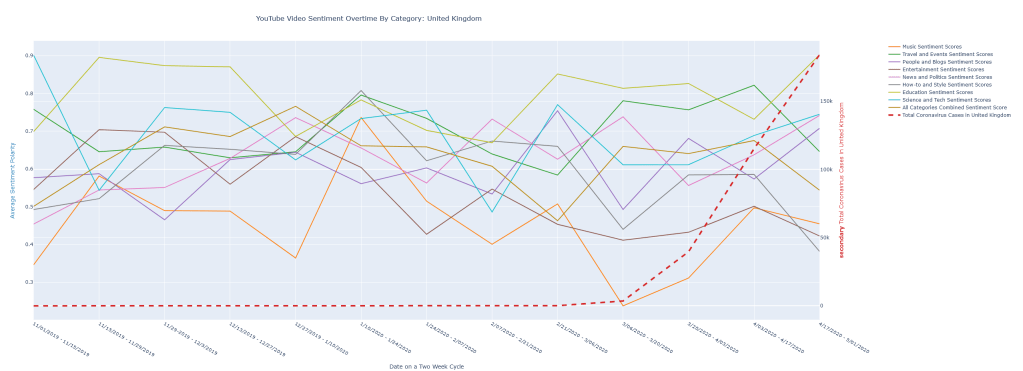
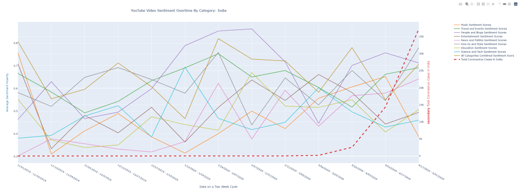
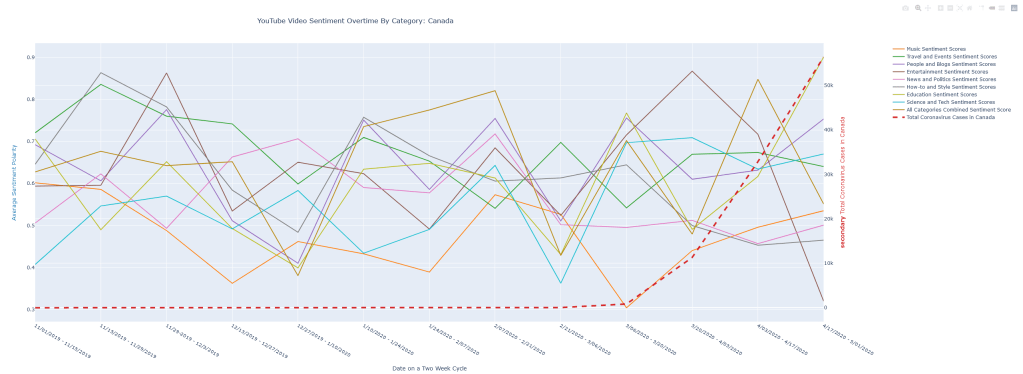
In this study, we investigate the association between the development of coronavirus and the sentiment score of the top 10 most popular YouTube videos published before and during the coronavirus pandemic. We wanted to see whether popular content creators were publishing more positive videos or negative videos as a result of the COVID19 pandemic. Doing this allows us to not only target popular YouTube content creators, but also look at which videos consumers are more likely to access. This is because the popularity of videos on YouTube depend on both the popularity of the content creator (their videos get promoted more) and consumers being inclined to access individual videos.
Essentially, we are performing hypothesis tests where our null hypotheses are: 1. The proportion of the top 10 most popular videos in each category with positive sentiments is the same before and after the onset of coronavirus, and 2. The mean sentiment score of the top 10 most popular videos in each category is the same before and after the onset of the virus. We receive a rather erratic set of results back. YouTube videos including categories such as Australia – People and Blogs, Canada – How-to and Style, India – News, and United Kingdom – Entertainment, displayed p-values below 0.05. In these cases, we have sufficient evidence to conclude that the proportions of videos with positive sentiments is different in those categories before and after the onset of Coronavirus in these respective countries.
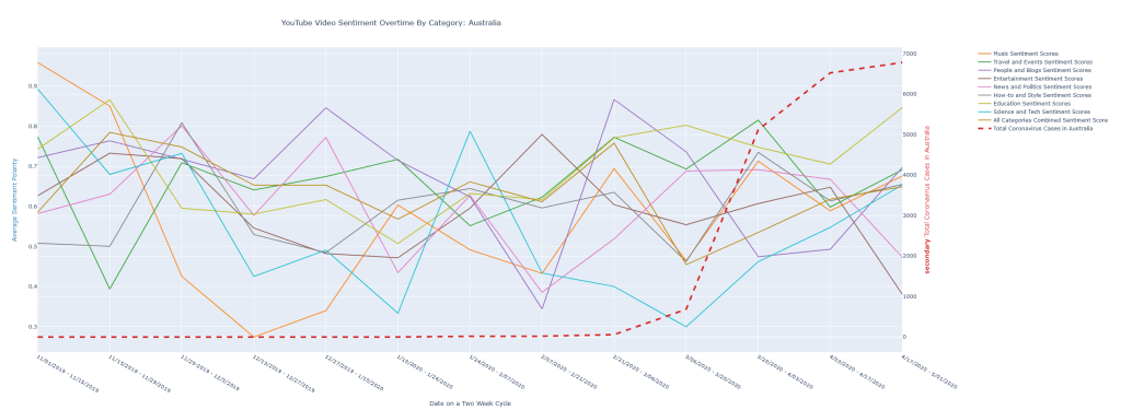
However, in much of the other categories, there is not enough evidence to reject the null hypothesis. When graphed, the mean and quartile ranges of sentiment scores display erratic behaviors. Furthermore, when we graph sentiment categories over time in tandem with Coronavirus infection quantities, little correlation is yielded. We speculate that this lack of difference may be due to the relative job security of popular YouTubers, as well as the generally manufactured personality that is imprinted upon large and more ‘methodical’ YouTube channels. Despite conditions worsening, perhaps large YouTube personalities must maintain their ‘personalities’ to preserve their view count and income.
Methods and Results
To explore this question, we needed a large dataset of YouTube videos that we could sort by the previously mentioned category and also by the country in which they were uploaded. We used Python in tandem with the YouTube API and Tensorflow deep learning libraries.
Calling the YouTube API, we scrape videos by designated location and category and get their transcripts using another python library. The locations we scraped consisted of Australia, Canada, India, the UK, and the US. The categories consisted of music, travel and events, people and blogs, entertainment, news and politics, how-to and style, education, and science and technology. We train and perform hyperparameter optimization an LSTM deep learning model for the task of sentiment analysis, and then run our transcripts through this model to get the sentiment outputs.
Our Covid data was compiled data from Johns Hopkins and organized into the same two week windows as our YouTube API.
The first step in data analysis was data summary and getting a picture of general trends of the datasets we have. We know that Covid cases increase rapidly over time. First we plotted a scatterplot of sentiment values and Covid cases associated with their respective two week periods and tried to fit linear regressions on them to get a general idea. These tend to be quite noisy, and a couple of these graphs can be seen below. All full HTML interactable graphs can be found in the Github page under “visualizations”
Because we did not see any strong obvious correlations on the scatterplots, we decided to take the approach of performing two independent proportions and independent means tests. Our null hypotheses are that the proportions of videos with positive sentiments published are the same and that the mean sentiment scores of videos published are the same pre and post first Covid case in the country and pre and post outbreak. We defined outbreak as the first two week window with over 1000 cases.
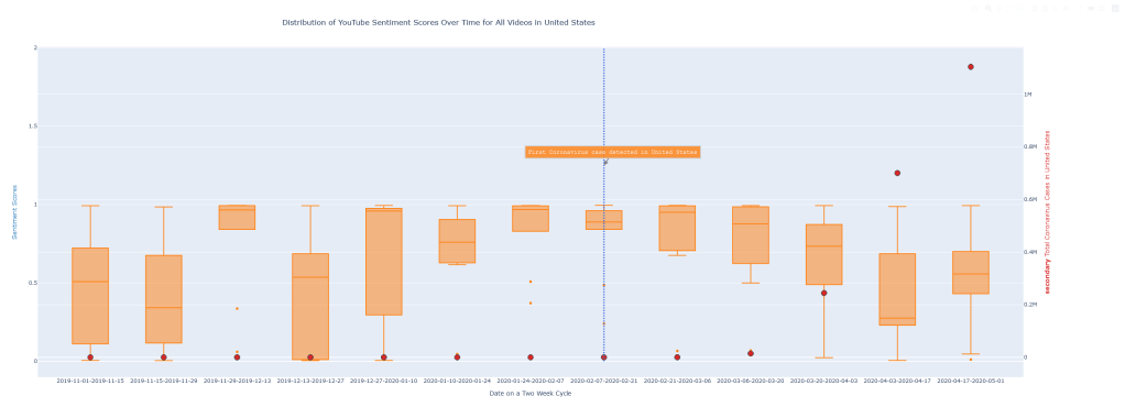
In order to get a good idea of the trends, we made boxplots of sentiment scores grouped by two week windows. For most categories, we do not have enough evidence to reject the null hypothesis. However, the differences in proportions and means that were significant provides good insight into the tendencies of content creators on YouTube, especially ones that are likely to be popular. 95% confident null hypotheses rejections are shown in these tables. Not only do our sentiment scores provide insight into videos published, but also display the viewing patterns of consumers. A sample boxplot is displayed below:
An interesting trend that occurred fairly frequently is the more notable difference in sentiment proportions and means in the first few two-week-windows after the first covid case, and the proportions and means reverting back to its original sentiment patterns after those few windows. This trend can be seen from the boxplots where there is a dip or rise in box plots 2-3 windowns after the first covid19 case and returning to the same levels after. This can also be seen from the generally lower p-values of tests between pre and post first covid case compared to p-values of tests between pre and post outbreak. The lower p-values for pre and post first Covid case tests indicate that the differences in proportion and mean are more a result of the differences in proportions and means in the few windows that immediately follow the first Covid case.

Leave a comment